Barbershop · Leixlip, Ireland

A barbershop site with the same precision as the work it shows

MK Barbers Level Up already had real character. My job was to turn it into a complete website voice — sharp without trying too hard, useful without losing the attitude.

Open the live website
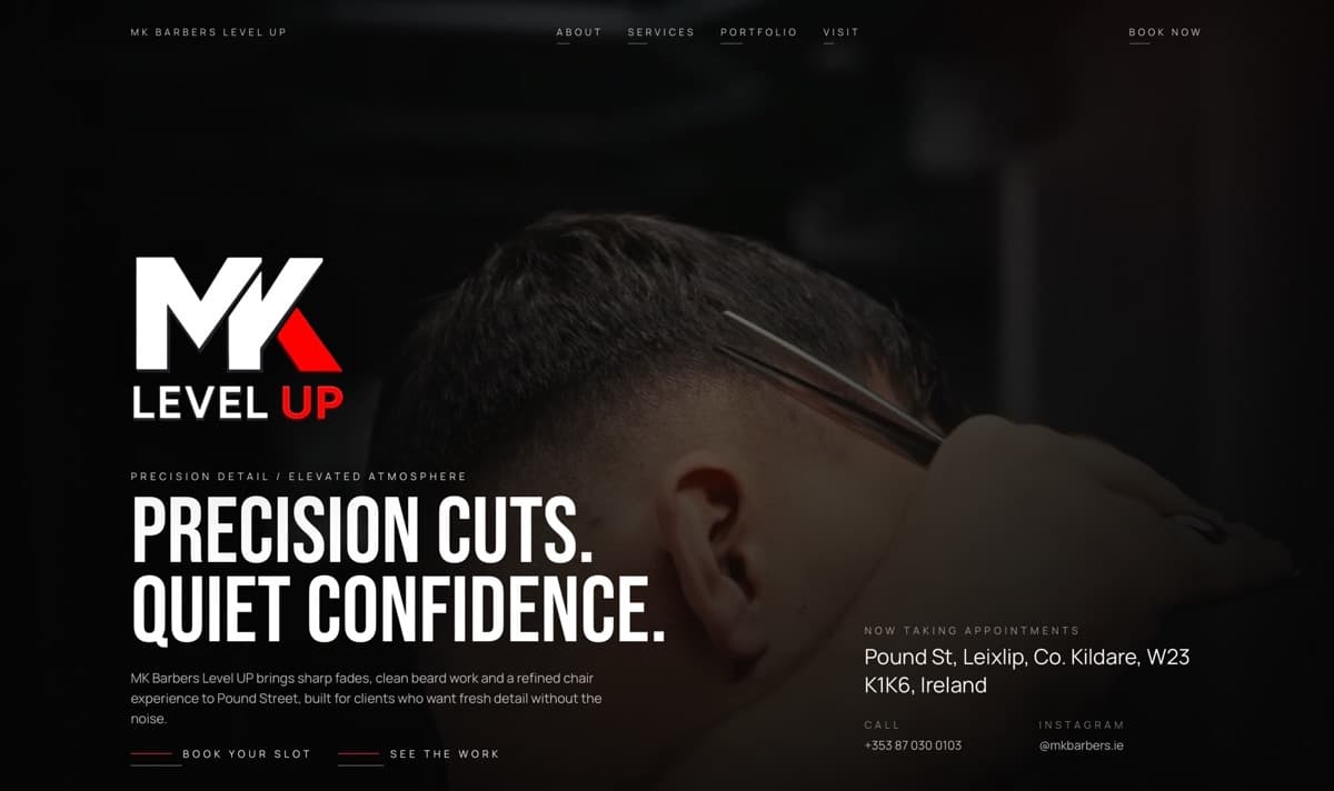
MK Barbers Level Up website with a dark haircut image and bold typography
The live website may continue to change after handoff.
Business
Local barbershop
My role
Full creative + development
Live flow
Work, prices, location and booking

My part in the project

Everything visitors read, navigate, and use was designed and built by me

I created the website structure, wrote all page copy, set the visual direction, designed the responsive interface, developed the site, and configured its contact and booking-related integrations.

Created by me

  • Brand voice and website copy
  • Information architecture
  • Visual direction and typography system
  • Services, pricing, portfolio, and visit sections
  • Responsive UX/UI
  • Frontend development
  • Contact, social, directions, and booking paths

Provided by the client

The identity and real shop material came from the client. The website system around them was my work.

  • Logo
  • Haircut and shop photography
  • Integration materials and account access

Finding the voice

The shop had attitude. The copy could not sound like a chain

I wrote the site in the same register as the visual work: short, controlled, and confident. Lines such as “Precision cuts. Quiet confidence.” set the tone, but the supporting copy still tells a first-time visitor exactly what the shop does and where it is.

The result feels specific to MK Barbers rather than a generic barbershop template with a different logo.

Let the work speak

Photography gets the stage, but never at the expense of the next step

The dark interface, condensed display type, and restrained red accent frame the real cuts. I designed the portfolio to feel editorial while keeping Instagram, directions, and booking actions close enough to use.

No guesswork

Prices and practical details belong in the brand experience

The service menu is direct: cuts, beard work, student options, essentials, prices, and booking notes. I avoided hiding those details behind a vague “contact us” because local clients often want the answer before they make a call.

  • Clear groups instead of one long price list
  • Opening hours and address visible before the footer
  • Call, Instagram, and directions as distinct actions

Local intent

A beautiful page still has to get someone to Pound Street

Location, opening hours, phone, Instagram, and directions are repeated with purpose. The site supports the real-world visit rather than behaving like a brand campaign that ends at the screen.

Built for the phone in hand

The mobile version keeps the shop one tap away

Portfolio images retain their impact on a narrow screen, while services and visit details become easier to scan. The responsive build keeps touch actions generous and avoids turning the strong typography into clipped poster fragments.

Functional outcome

A distinct live brand site that also works as a local shop tool

The website presents MK Barbers Level Up as a specific place with a clear point of view, then gives visitors the prices, work, hours, location, and contact routes needed to act.

Open the live website

A similar project

Need a website built around the way your customers actually choose?

Tell me what the business sells, what is getting in the way, and what a visitor should do next. I’ll come back with a clear direction for the project.

Discuss your project