Massage service · Tampa Bay

A massage website that makes two ways to book feel simple

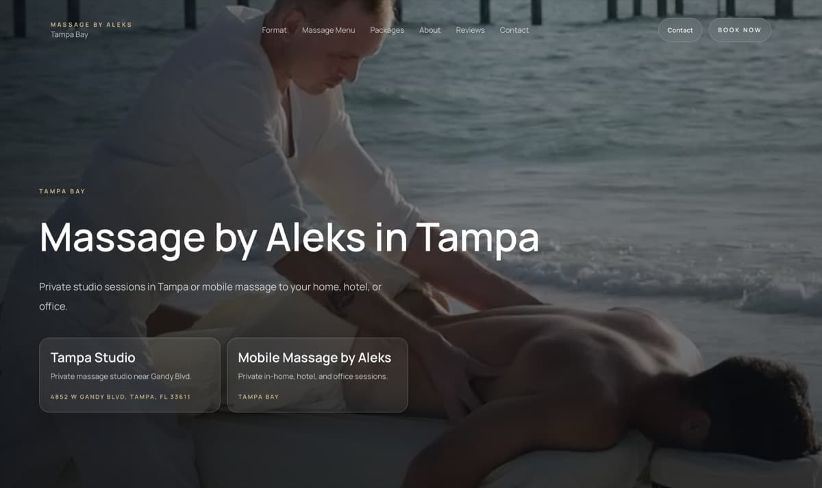
Massage by Aleks serves clients in a private Tampa studio and on location. I built the site from a blank page around that first choice, then carried the same clarity through services, packages, proof, and booking.

Open the live website
Massage by Aleks website showing studio and mobile massage choices
The live website may continue to change after handoff.
Business
Private studio + mobile massage
My role
Full website, built from scratch
Live flow
Services, packages and booking

What I actually did

The entire website system — from the first sentence to the last responsive state

I was responsible for the structure, all website copy, visual direction, UX/UI, responsive design, development, integration setup, and launch-ready details. This was not a theme customization or a supplied layout.

Created by me

  • Page strategy and information architecture
  • English copy and service explanations
  • Visual design and interaction direction
  • Desktop, tablet, and mobile layouts
  • Frontend development and reusable content sections
  • Booking, package, and checkout paths
  • Technical integration setup and final QA

Provided by the client

The client supplied the brand materials and the real-world content I needed to work with; I shaped those materials into the website experience.

  • Logo
  • Photography and video
  • Integration materials and account access

The first decision

Studio or mobile should take seconds to understand

The business does not offer one generic appointment. A visitor first needs to know whether they want a private studio session or massage at home, in a hotel, or at an office. I made that decision visible immediately instead of burying it inside a service list.

Both paths still belong to the same brand, so the design stays calm and consistent while the copy makes the practical difference clear.

Content before decoration

A premium feel only works when the details are easy to compare

Massage services can become a wall of similar names. I wrote each option around what the session is for, what it may include, how long it takes, and what it costs. That gives visitors something useful to compare without flattening the experience into a price table.

  • Separate treatment intent from duration and price
  • Keep add-ons close to the sessions they belong to
  • Explain packages without interrupting single-session booking

Trust in context

Proof sits beside the moment a visitor is still deciding

The live site includes client stories, review signals, and video feedback supplied by the business. I did not treat them as a detached testimonial wall. They support the decision before the service menu and booking path ask for commitment.

Booking path

From a specific need to the right next step

Service cards, packages, direct booking, contact, and phone actions all lead somewhere intentional. I configured the integrations and made the transitions feel like part of the same site rather than a collection of external tools.

Small screens

The mobile version puts decisions before atmosphere

On a phone, the service choice, essential details, price, and booking action stay in a readable order. Large photography still carries the tone, but it never pushes the practical answer out of reach.

Responsive behavior was designed and built as part of the project, not added as a compressed desktop afterthought.

Functional outcome

One live site for discovery, comparison, trust, packages, and booking

The finished website gives Massage by Aleks a complete path from the first studio-or-mobile decision to an individual service, a recurring package, or a direct booking action.

Open the live website

A similar project

Need a website built around the way your customers actually choose?

Tell me what the business sells, what is getting in the way, and what a visitor should do next. I’ll come back with a clear direction for the project.

Discuss your project